You have spent months, perhaps years, transforming your data. The budget is adopted, the team is constituted, and everybody is busying him/herself manipulating datasets as though their lives are at stake.
However, the million-dollar question is: How do you know whether it really works?
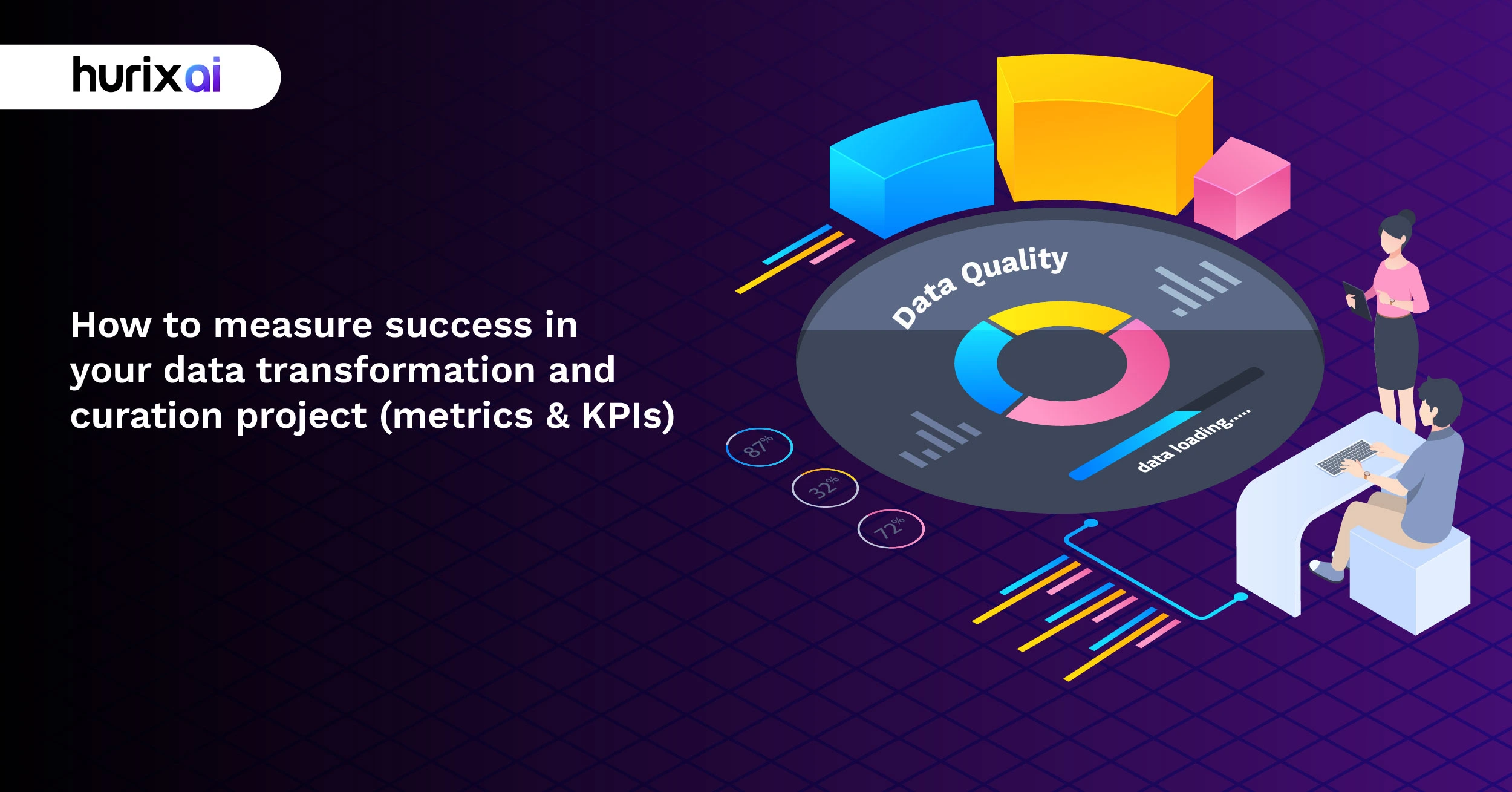
You have to fly blind without the appropriate data quality metrics to indicate your progress. And no one wants to be the one who spent 6 months on a project and then realizes that they have been maximizing on everything being wrong.
Let’s fix that.
Table of Contents:
- What Are Data Quality Metrics and Why Should You Care?
- Why Traditional Success Measures Fall Short?
- How to Choose the Right Data Quality Metrics for Your Project?
- The 7 Essential KPIs Every Data Transformation Project Needs
- When to Measure: Setting Up Your Monitoring Cadence
- Setting Realistic Benchmarks and Improvement Targets
- Common Pitfalls That Sabotage Data Quality Measurement
- How to Turn Your Metrics into Action?
- Making Your Metrics Dashboard Executive-Friendly
- Conclusion
- FAQS
What Are Data Quality Metrics and Why Should You Care?
Here’s the thing about data transformation projects: they’re expensive, time-consuming, and absolutely critical to your business. Which makes them terrifying.
Data quality metrics are your safety net. They’re the quantifiable measurements that tell you whether your data is actually fit for purpose. Think of them as your project’s vital signs—except instead of checking pulse and blood pressure, you’re monitoring accuracy, completeness, and consistency.
The beauty of these metrics? They turn fuzzy concepts like “good data” into concrete numbers. No more guessing. No more relying on gut feelings during board meetings.
When you measure data quality properly, you get:
Clear evidence of progress that even the CFO can understand. Early warning signs when something’s going sideways. Justification for resources (because someone’s going to ask why you need more budget). Confidence that your downstream analytics actually mean something.
Without metrics, you’re essentially asking your stakeholders to trust you blindly. With metrics? You’ve got receipts.
Why Traditional Success Measures Fall Short?
You know what’s wild? Most organizations measure their data transformation success using metrics that are completely irrelevant.
“We migrated 10 terabytes of data!” Cool. Is any of it usable?
“We finished two weeks ahead of schedule!” Fantastic. Does the data actually work in production?
“We came in under budget!” Amazing. Can your analysts actually make decisions with it?
Speed and cost matter, sure. But they’re not measuring what actually counts: whether your data transformation delivers business value.
Traditional project metrics tell you if you executed the work. Data quality metrics indicate whether the work was worthwhile in the first place. There’s a massive difference.
Your legacy systems didn’t care about data quality because humans were filling in the gaps. Your shiny new data infrastructure? It’ll happily process garbage data at lightning speed and serve you perfect-looking reports filled with complete nonsense.
That’s why you need a different playbook.
How to Choose the Right Data Quality Metrics for Your Project?
Choosing the right metrics is not rocket science; however, some important considerations are necessary. This is how it can be done without overthinking and paralysing.
Start with Your Business Objectives
What problem are you actually trying to solve? When creating a 360-degree picture of your customers, you are likely highly concerned with wholeness and consistency. When building a compliance reporting system, there is no room for compromise on accuracy and timeliness.
Your metrics should map directly to these goals. Everything else is just noise.
Focus on the Six Core Dimensions
All the dimensions of data quality revolve around the following:
Accuracy is the test of whether your data is accurate or not. Are the values correct? Is the customer’s email address effective? Is the inventory count right?
This is your baseline. And nothing matters when your data is not accurate. The validation rates, error rates, or comparison to trusted sources can be used to follow accuracy.
Completeness shows the presence of all the necessary data. Projects are sunk quickly by a lack of fields than by just about anything. This can be measured by the percentage of null values, compulsory completion rates of the fields, or completion of record scores.
Bonus! Not every piece of missing data is the same. Missing middle names? Probably fine. Missing customer IDs? Catastrophic.
Checks of consistency to determine whether the data is alike in the systems. Are there various databases in which California is abbreviated as CA, Calif, or California? That’s a consistency problem. Measure compliance rates of track standards and cross-system match rates.
Measuring timeliness is whether the data is available when required. Data that is day old, which is used to detect fraud in real-time, is like a smoke detector that wakes up the following day. Keep track of the data latency of the monitor, frequency of updates, and staleness.
Validity guarantees the company that the data is in line with business rules and constraints. Is the birthday date prior to today? Is the email format correct? Do the dropdowns contain the approved ones? Measure in terms of rates of violation of constraints and compliance with the schema.
Distinctiveness will prevent duplicate records from having a havoc effect. There is no quicker way of breaking down trust than by sending three emails to the same customer. Deduction of tracks and of accuracy of entity resolutions.
Make Your Metrics SMART
Imprecise measures are useless measures. The benchmark of improving the quality of the data is a desire rather than an indicator. You can actually work for over six months; something like reducing data entry errors by 15 to 5% within six months.
All the metrics must be Specific (what are you measuring?), Measurable (is it quantifiable?), Achievable (is it realistic?), Relevant (does it matter to the business?), and Time-bound (when will you meet the target?).
The 7 Essential KPIs Every Data Transformation Project Needs
Let’s get practical. These are the seven KPIs that invariably make the difference between successful data transformation projects and disastrous projects that cost more than companies can afford.
1. Data Accuracy Rate
This is your headline number. What is the percentage of data you are right on? Generally, industry conventions suggest striving for 99%+ accuracy in critical areas, although tolerable levels vary depending on the application.
Calculate it by comparing samples against trusted sources or through validation checks. If you’re below 95%, you’ve got serious problems.
2. Data Completeness Score
What is the percentage of filled-in fields that are required? Split this into field criticality tier 1 (must have), tier 2 (should have), and tier 3 (nice to have).
It is impractical to aim for 100 percent on all things. But tier 1 fields? Those need to be near-perfect.
3. Time-to-Insight
What is the time lag between generating data and using it? This measures the effectiveness of your overall pipeline. When the analysis of last month’s sales turns out to be a three-week affair, then your transformation project is not addressing the right issue.
Monitor this through time-stamping of information at ingestion and consumption. The gap tells you everything.
4. Data Processing Success Rate
What is the percentage of data loads that complete without errors? Unsuccessful pipeline executions are productivity killers. A single load failure in a day can result in dozens of hours of troubleshooting.
Track the rate of success and the average mean time to fix issues in the event of failure.
5. User Adoption Rate
Are individuals utilizing the transformed data? The best dataset in the world, which is well-curated, is useless when it remains untouched. Monitor distinct active users, query frequency, and dashboard activity.
The low rate of adoption is normally a pointer to quality concerns or usability problems. Both need fixing.
6. Data Lineage Coverage
Is it possible to follow the data between the source and the consumption? How do you describe the origin of the information and how it was manipulated to produce any given report or insight? This is very important for compliance, debugging, and trust.
Measure the percentage of data assets with complete lineage documentation.
7. Business Impact Metrics
Give your data work a dollar connection. Was customer segmentation enhanced? Are forecasts more accurate? Was there an increase in operational efficiency? These measures are valuable to people in top management who are not concerned about your rate of data accuracy.
Revenue impact, cost savings, time savings. Select the ones that are significant to your organization and religiously monitor them.
When to Measure: Setting Up Your Monitoring Cadence
Timing matters. Measure too seldom, and you will not discover the problems before they become disasters. Measure too frequently, and you will be drowned in sounds.
Continuous Monitoring is applied to vital operating measures. Real-time or near-real-time tracking of accuracy, completeness, and success rates of the processing should be accompanied by automated warnings for threshold violations.
Weekly Reviews are the best when it comes to trend analysis. Are things improving? Plateauing? Getting worse? Dashboards: You have just the right amount of data to see patterns without being overwhelmed by details (weekly).
Monthly Deep Dives will enable you to examine root causes, assess changes in processes, and present findings to stakeholders. This is where you give the story behind the numbers.
Quarterly Business Reviews are a strategy that links business metrics to data measures. Was there better data quality metrics that influenced revenue? Customer satisfaction? Operational efficiency? This is executive territory.
The trick is to have a rhythm that allows issues to be identified early, giving your team the space to actually fix the problem.
Setting Realistic Benchmarks and Improvement Targets
Here is a dirty secret: there is no universally accepted standard for good data quality scores. A 90% accuracy rate could spell doom for medical records, yet sentiment analysis is quite accurate.
Your benchmarks must be put into perspective.
It is all about setting your base. Where are you today? Be honest. Assess the current state of affairs on all your desired metrics before making any changes. This provides you with the point of reference and also prevents you from declaring victory too soon.
Then, the standards of the research industry. What are other organisations of this type getting? Retail is generally less accurate than healthcare. Financial services should be more timely as compared to manufacturing. Join your peer group and see what is realistic.
Next, add your level of maturity. And even when you first embark on your transformation of data, you should not be planning the best-in-class metrics right at the beginning of your career. strategy; pre-plan improvement. You can achieve 75 percent in your first year, then 85 percent in the second year, and finally 95 percent in the third year.
Small wins build momentum.
And please, build in buffers. Achieve 100 percent of your set goals, and people will wonder whether you were trying hard enough. Get halfway, and you are discredited. Aim for 80-90% success rates, as such you have space to have any unforeseen difficulties.
Common Pitfalls That Sabotage Data Quality Measurement
Even with the right metrics, projects still fail to succeed. Usually for preventable reasons.
Vanity Metrics
Measuring things that look impressive but don’t matter. “We processed 5 billion records!” means nothing if those records are inaccurate or incomplete. Focus on metrics that actually correlate with business outcomes.
Measuring Too Much
This is surprisingly common. Teams try to track 47 different metrics because they can’t decide what matters. You end up with dashboard sprawl and analysis paralysis. Five to seven core metrics is the sweet spot. More than ten and you’re not focused enough.
Ignoring Context
This kills credibility. Presenting that your error rate jumped 300% sounds terrible until you mention you started tracking errors you weren’t measuring before. Always provide context. Compare to baselines. Explain anomalies. Tell the story behind the numbers.
Static Thresholds
It becomes obsolete fast. What was considered acceptable quality six months ago may not be sufficient today. Review and adjust your targets as your organization matures and business needs evolve.
Forgetting the Human Element
Forgetting Human in the loop is the biggest mistake. Data quality isn’t just a technical problem. Poor quality often stems from process issues, training gaps, or misaligned incentives. Your metrics should help you identify where people need support, training, or clearer guidelines.
How to Turn Your Metrics into Action?
Data quality metrics are only valuable if they drive improvement. Here’s how to close the loop.
Create Clear Ownership
Every metric needs an owner. Who’s responsible for accuracy? Completeness? Timeliness? When a metric starts to slide, who receives the alert and has the authority to correct it?
Shared ownership means no ownership. Assign names.
Build Feedback Loops
Users should be able to report quality issues easily. Make it dead simple. A “report problem” button. A dedicated Slack channel. Whatever fits your culture. Then, actually respond to reports. Nothing kills participation faster than reporting problems that disappear into the void.
Automate What You Can
Manual measurement is expensive and inconsistent. Invest in automated quality checks, validation rules, and monitoring dashboards to enhance operational efficiency. Let computers handle the mundane tasks so humans can focus on solving problems.
Celebrate Wins Publicly
When data quality improves, make noise about it. Share the metrics. Thank the team. Connect improvement to business impact. Positive reinforcement works better than blame.
Making Your Metrics Dashboard Executive-Friendly
The fact that you have a beautiful, detailed technical dashboard is irrelevant in cases where it is disregarded by executives. Here’s how to fix that.
Lead with Business Impact
Start with the “so what.” Do not start with information accuracy has gone up by 3 percent. Introduced with enhanced precision, this made $500K in reclaimed revenue possible. Money talks.
Use Visual Hierarchy
The most significant metrics should be placed first, in the largest fonts. Apply color wisely- red when depicting a critical matter, yellow when depicting a warning, and green when depicting good. But don’t go overboard. It is a Christmas tree dashboard rather than having no dashboard.
Provide Context
Show trends over time. Include targets and thresholds. Add brief annotations explaining spikes or dips. “Accuracy dipped due to new data source integration—expected to normalize next week” tells a complete story.
Keep It Simple
Do not succumb to the temptation to reveal everything. Executives must have the highlights. Breakdowns can be saved to the team reviews. A five-to-seven-key-metric one-page document is better than a 20-page report that no one reads.
Conclusion
Look, measuring success in data transformation isn’t simple. But it’s absolutely necessary.
The right data quality metrics give you clarity, confidence, and credibility. They turn abstract concepts into concrete progress. They help you catch problems early and prove value to skeptical executives.
Start small. Pick three to five metrics that align with your most critical business objectives. Measure honestly. Track consistently. Adjust as you learn.
And remember: perfect data doesn’t exist. The goal isn’t perfection—it’s continuous improvement toward data that’s fit for purpose.
Need help defining the right metrics for your data transformation project? Our team at Hurix.AI specializes in building data quality frameworks that actually work in the real world. We’ve helped dozens of organizations turn their data chaos into a competitive advantage.
Frequently Asked Questions (FAQs)

Vice President – Content Transformation at HurixDigital, based in Chennai. With nearly 20 years in digital content, he leads large-scale transformation and accessibility initiatives. A frequent presenter (e.g., London Book Fair 2025), Gokulnath drives AI-powered publishing solutions and inclusive content strategies for global clients